A ramen packaged styled with kitsune tails art

Instructions I posted on Pastebin for getting Kitsune Tails working on macOS. Kitsune Tails is a delightful platformer my children and I waited a long time for, and we celebrated it's release with a few days of playing only Kitsune Tails. We set up the livingroom to play and watch each other play.

Kitsune Tails received a huge amount of positive press on it's release, and it's well deserved. It's a side scrolling platormer with a virtual console. It has FPS mini games. It has modding. It has kick-ass music, and the voices are top tier.

I did not want to only watch the kids play, but my computer is a mac, and Kitsune Tails does not run on macOS. At least, not out of the box.

Below is all my notes on getting it to work, along with caveats and context, first posted 2024/08/02. As of 2024/10/13 it's about the same as the pastebin, which will be updated as necessary.

Read more →

Desktop Kittens Logo

New platform to play on!

Desktop Kittens have come leaping into Windows, running rampant on your computer, distracting you from all the UI stuff in Windows you've come to hate.

Advertisements got you down? Start menu annoyingly in the middle of the screen? CoPilot creepily tracking everything you do? Who cares!? There's kitties on your desktop, playing and having fun.

ARM and x86 support!

Use the extra performance features of your AI enhanced Windows ARM laptops for kitties instead of glorified random word generators. They are much more adorable than suggestions to eat poison mushrooms or mismanaging your private data.

It's a new home, they might need help adjusting

Let me know if there's some show stopping bugs or weirdness.

Download on itch.io

Visual DOS 2024 is a game that takes place in an alternate reality where DOS remained everyone's primary operating system. Because it takes place in an alternate reality, I wanted parts of the UI to feel foreign, and slightly different. One of the ways I acheive this is by using an uncommon caret (insertion point) design. The idea of this design is to show text to the left will be deleted if pressing backspace, and to show where the next letter will appear if you type it.

Screenshot of an insertion point, in addition to the normal line, it has a red underline on the left, and a top and bottom bracket on the right

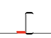
It doesn't work exactly like Raskin's vision, where there would be changes to indicate the direction you were going in, but it serves it's purpose, and I find it delightful to use.

My understanding is these classes are not reachable through the API, so this was done using a plugin called Apc Customize UI++, and the stylesheet for it is below:

":root" : {
            "--cursor-color": "rgb(220, 138, 120)",
            "--cursor-color": "black"
        },
        ".monaco-editor .cursors-layer.cursor-smooth-caret-animation > .cursor" : {
            "transition": "all 0.15s"
        },

        ".monaco-editor .cursors-layer.cursor-underline-style > .cursor": {
            "border-bottom": "2px solid var(--cursor-color)",
            "border-top": "2px solid var(--cursor-color)",
            "border-radius" : "3px",
            "background": "transparent !important",
            "height": "1rem !important",
            "width": "1em !important",
            "overflow": "visible !important",
            "margin-top": "-1rem",
            "box-sizing": "content-box",
            "animations-name": "none !important"
        },

        ".cursor-smooth" : {
            "animation": "vdos-right 0.5s ease-in-out 0s 20 alternate;"
        },

        ".monaco-editor .cursors-layer.cursor-underline-style" : {
            "overflow":"visible"
        },
        ".monaco-editor .cursors-layer.cursor-underline-style > .cursor::before": {
            "height":"0.9rem !important",
            "background": "transparent !important",
            "border-right-width": "2px !important",
            "border-right-style": "solid !important",
            "border-right":"2px solid var(--cursor-color)",
            "border-bottom" : "3px solid red",
            "border-radius" : "2px",
            "display": "block",
            "content": "' '",
            "position": "absolute",
            "box-sizing": "content-box",
            "width": "1em",
            "left": "-1em",
            "transition" : "all 1s !important",
            "animation": "monaco-cursor-smooth 0.5s ease-in-out 0s infinite alternate"
        },

        "@keyframes vdos-right": {
            "0%" : {
                "opacity" : "100%"
            }
        }

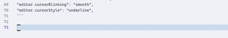
I'm overriding the underline cursor for this, and the smooth animation, so the following settings need to be set too:

"editor.cursorSmoothCaretAnimation": "on",
"editor.cursorBlinking": "smooth",
"editor.cursorStyle": "underline",

After making these changes, you'll have a caret in Visual Studio that looks just like the below.
Animation showing the new caret while typing

My vivaldi themes can be found on Vivaldi.net. Bellow are a few, mostly based on operating systems and past browsers.

Opera 7.0 Theme

Opera 7.0 Theme

When Opera 7 was released, it came with a very nice default theme that was relatively refreshing, with 3D icons, and a new mail client.

It did not last long, and in Opera 7.54 the icons were replaced with flat ones.

The 39 icons here were based on the originals, created from scratch as SVG's.

Opera 7.54

Opera 7.54 Theme

A theme based on the default Opera 7.54 Standard theme, from all the way back in 2004. Fourty-one SVG icons were created based on the 7.54 standard theme.

Haiku OS

Haiku OS Theme

A theme created in hopes that Vivaldi will one day be released on Haiku OS.

Icons from darealshinji's exported Haiku icons, Haiku-OS, and some modified/created by me.

Navigator 6

Navigator 6 theme

A dark blue theme based on Netscape Navigator 6 beta. Although this look did not last long, I was always fond of it.

A total of 16 icons were created for this theme, based on the beta of Netscape version 6.

SeaMonkey Modern

SeaMonkey Modern theme

When Netscape 6 was publicly released, it shipped with a different theme. It was a lower contrast theme that had depth, instead of the flat theme of the beta.

Twenty-eight SVG icons were created for this theme.

View more themes on Vivaldi.net